The Role of Social Media Graphics in Vacation Rental Marketing & How to Optimize for Maximum Engagement
What You’ll Learn
The vacation rental industry is highly competitive with everyone and their mother using social media to capture potential customers' attention. With years of experience managing numerous clients and helping them stand out, we know the importance of uniqueness and proven practices that can boost your visibility. By the end of this article, you’ll learn what an effective social media graphic looks like and a few common mistakes to avoid. The ultimate goal is to help you become more effective in managing social media so that you can drive more traffic to your website and increase your direct bookings.
Why Social Media Graphics Matter in Vacation Rental Marketing
-
First Impressions Count: Social media users spend mere seconds deciding whether to engage with a post. Attractive graphics catch their eye instantly, sparking curiosity and leading them to learn more.
-
Communicate Value Quickly: Graphics can communicate property features, highlights, and emotions faster than text alone. This is particularly useful in vacation rentals, where audiences want to envision their experience.
-
Encourage Sharing: Eye-catching and relevant graphics increase the likelihood of shares, which broadens reach and puts a property in front of potential guests organically.
-
Support Brand Identity: Consistent and high-quality graphics help build a recognizable brand. For vacation rentals, branding helps audiences remember the experience associated with a rental, especially when combined with a unique style.
-
Drive Bookings: Ultimately, the goal of effective social media graphics is to inspire users to book. With an appealing design that highlights the property's best features, viewers can imagine their stay and are more likely to take action.
The Mistake You Might Be Making
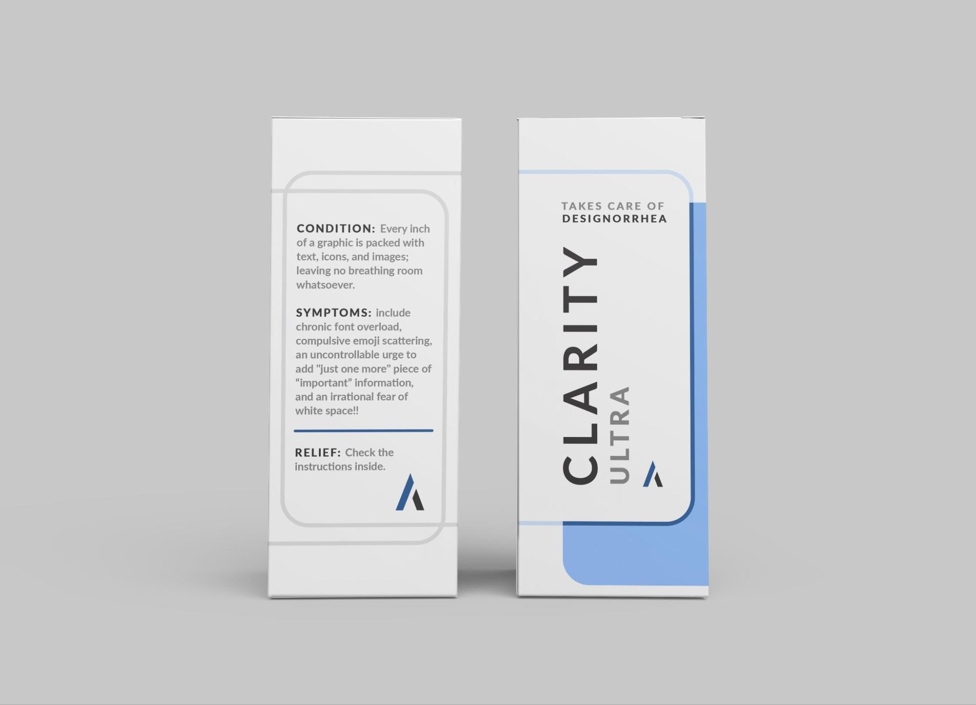
I could spend the rest of my career pointing out ALL the mistakes people are making…so, instead, I’ll just point out the most common mistake - Let’s just call it “Designorrhea” It’s a “condition” where every inch of a graphic is packed with text, icons, and images; leaving no breathing room whatsoever. Symptoms include chronic font overload, compulsive emoji scattering, an uncontrollable urge to add "just one more" piece of “important” information. Oh yeah…also an irrational fear of white space!!

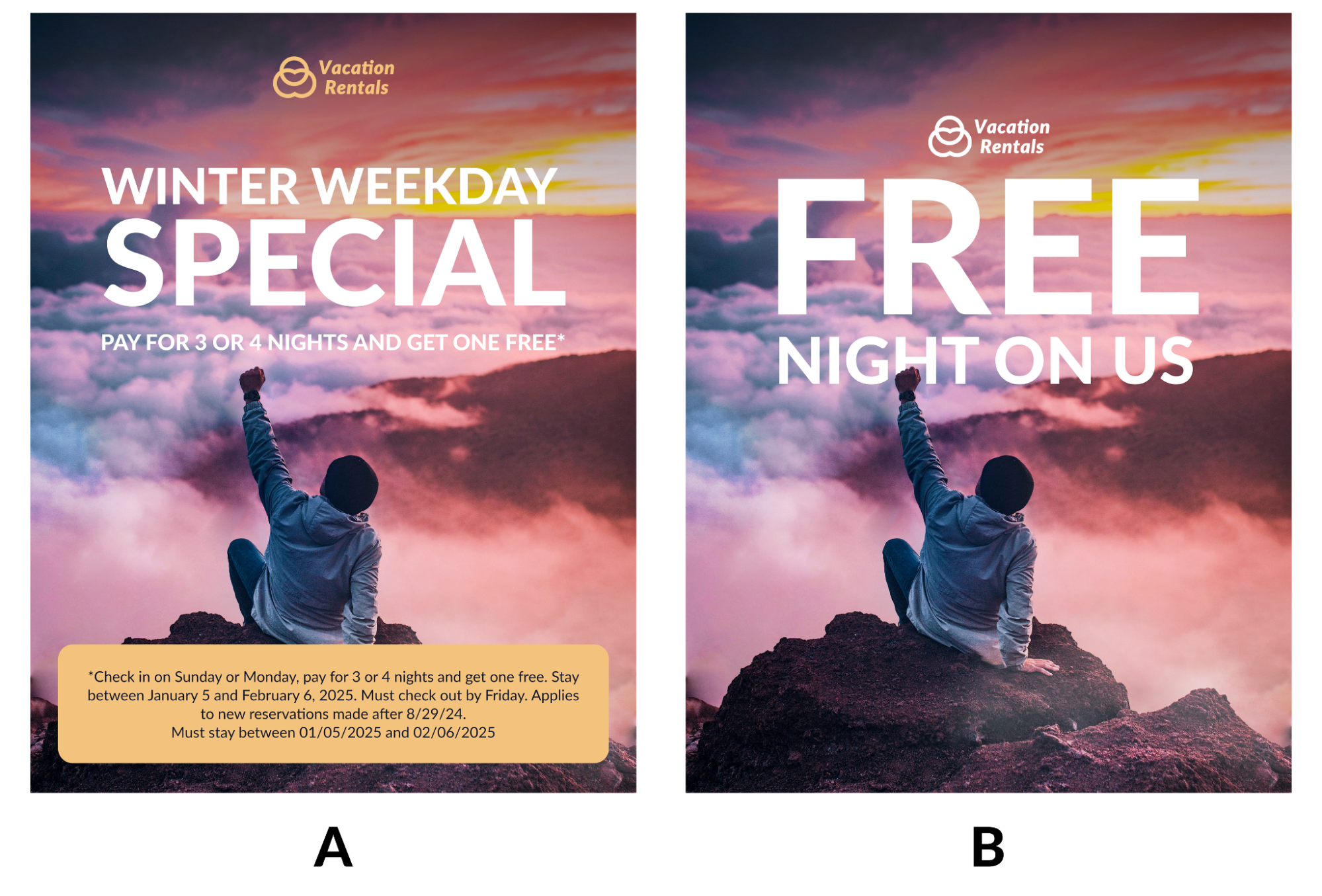
I’m essentially saying that most graphics are WAY TOO OVERCLUTTERED. Just take a look at the two examples below. If you only have a few seconds to grab someone's attention and get your point across, which graphic do you think would be most effective?
Let’s Compare

Graphic A
-
Too Much Text: Graphic A includes multiple lines of text, including a small box with fine print at the bottom. The sheer amount of information makes the graphic feel cluttered and overwhelming. On social media, users tend to scroll quickly, so concise messaging is crucial.
-
Small Font and Dense Information: The fine print box at the bottom is packed with details in a small font. While the information may be necessary, it would be better suited for a caption or link. On social media graphics, small text can be difficult to read and is often ignored, especially on mobile devices.
-
Lack of Focus on the Main Offer: The graphic’s headline, "WINTER WEEKDAY SPECIAL," competes with additional lines, such as "PAY FOR 3 OR 4 NIGHTS AND GET ONE FREE," and the fine print. This detracts from the core message and makes it harder for viewers to immediately grasp the promotion.
-
Overcrowded Layout: The layout of Graphic A feels crowded due to the multiple elements and blocks of text. This cluttered design creates visual noise, which can reduce the impact and make the graphic less visually appealing. Clean and open designs tend to perform better on social media because they are more inviting and easier to process.
-
Confusing Visual Hierarchy: Graphic A has too many elements fighting for attention, which dilutes the effectiveness of the main offer. In social media design, a strong visual hierarchy is essential; viewers need to be able to quickly identify what the post is about without sifting through multiple layers of information.
In essence, Graphic A has a bad case of Designorrhea. Its main issues are that it tries to convey too much information at once, lacks a clear focal point, and doesn’t use space efficiently. Simplifying the text, focusing on the key offer, and moving the details to the caption would greatly improve its effectiveness for social media.
Graphic B
-
Clear, Bold Text: The main message in version B, “FREE NIGHT ON US,” is large and easy to read. It uses fewer words, which makes it immediately attention-grabbing and understandable at a glance—essential for social media where people are scrolling quickly.
-
Minimal Distractions: Version A includes more text and an extra informational box at the bottom, which can make the design feel busy. In contrast, version B eliminates these distractions, keeping the focus on the core message. This streamlined approach enhances visual appeal and increases the likelihood of engagement.
-
Visual Hierarchy: Version B has a strong visual hierarchy, with the brand logo and main offer in prominent positions. The simplicity allows these elements to stand out, helping viewers absorb the important information quickly without having to read additional details.
-
Space for Imagery: The uncluttered design of version B lets the background image shine through, giving it an inspiring and serene feel. This makes the graphic more visually appealing, which is crucial for social media content that needs to stand out in crowded feeds.
-
Encourages Engagement: A clear and concise message, as seen in version B, is more likely to encourage viewers to take action, like clicking or reading more in the caption. Version A’s added details may be better suited for a website or flyer where people are willing to read more, but for social media, simplicity drives engagement.
To summarize this, version B better captures attention, conveys the message clearly, and aligns with the fast-paced nature of social media.
For vacation rental businesses, this approach isn’t just prettier—it’s strategic. People are scrolling fast, and Graphic B’s single, powerful message is way more likely to stop thumbs in their tracks. Graphic A, on the other hand, is like that over-enthusiastic friend who just has to tell you every little detail in one breath.

Conclusion
In the end, the secret to effective social media graphics is simplicity. Prioritize your audience's needs by clearly conveying the main benefit of your promotion, rather than overloading the design with unnecessary details. By focusing on a concise, visually engaging message, you can capture attention, inspire engagement, and boost direct bookings.
Are you tired of not seeing results from your marketing? Are you confused about what your marketing spend is actually achieving?! DIRECT BOOKINGS are the key to vacation rental success, and your business’s growth depends on them. We’re here to help you achieve that.